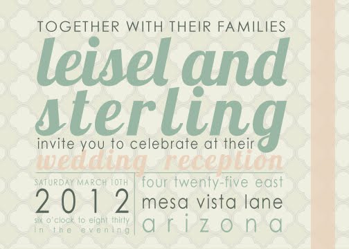


At present I'm deliberating between these three designs for my sister-in-law's wedding announcements? Issue your vote in the comments. She wants something polished yet informal that feels fresh but timeless.
We plan on sending out a digital version to save money and the environment, but close friends and family will receive a paper copy because I'm still sentimental about mail and tangible presence.
In the meantime, click here if you're looking to design your own wedding invitations.
Please don't pick the one with the cacti. It looked like a clump of... phallic objects at the top!!
ReplyDeleteBut the other two are very nice :)
Yep. I like the middle one, but that top clump of cacti is definitely phallic in appearance. Not what you're going for, I assume!
ReplyDeleteI like the bottom one too. I like the dark gray with white writing, nice and easy to read but very fresh.
I happen to love the cacti but the top one is easier to read on the computer.
ReplyDeleteI personally like the top one the best.
ReplyDeleteAlso, the second one has a typo on the start time. 6:00 vs 6:30?
Invite numero uno... my personal favorite ;-)
ReplyDeleteAll are great Mrs. Bagley. Well done.
xx
Love number 1!
ReplyDeletethanks for the heads up on the cactus. We will definitely choose an alternative cactus shape if we go for that one.
ReplyDeleteReally, really appreciate your help and feedback!
I actually like the second one the best (minus top cactus.) I think it looks more original and easy to read. To be honest, I've seen quite a few invites similar to the top one.
ReplyDeleteGreat job though, lady.
I like the bottom one best, the one with the heart.
ReplyDelete